Subjective:
Developer MrCiastku and publisher IceTorch Interactive present Shadows 2: Perfidia for review. Shadows 2: Perfidia hopes to provide a first-person horror experience that draws the player into its dark hallways and shadowy monsters.
Objective:
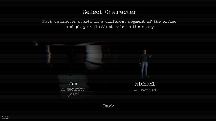
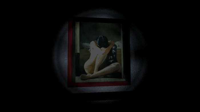
Shadows 2: Perfidia looks like a collection of generic assets at first. The slight palette swap between main characters reinforces this initial notion. But a bit of time in either story shows that developer MrCiastku is at least interested in providing as varied a visual experience as possible within a limited range of tools. The player will interact with various items to unlock the way forward and block the monster chasing them while looking through the world draped in shadow, the lens of a camera, green lights, and more. Audio is present if thoroughly unremarkable, and the attempted scares are undone by silly jerky motions in the monster.

Assessment:
The phrase “A for effort” kept springing to mind while I played Shadows 2: Perfidia. However, the effort invested in Shadows 2: Perfidia feels more in the B- range with the actual experience of play a D+. This makes the interest less in playing the game and more in considering the one interesting thing developer MrCiastku managed to do.
There’s a nice stab at the way men are pressured into toughing out situations where retreat is likely the better option. You have the option of holding your breath to avoid notice of the monster chasing you, and little messages like “Man up” and “Just get out” pop up. Those combine with little messages and alerts both player characters get about their partying prowess, hangovers, or work activities to paint a portrait of the manly expectations hung on them. When those messages pop up in the dark as your chosen character holds their breath it has an uncanny effect of showing how the pressure of masculine performance can seep into someone’s thoughts.

That’s an interesting idea in a superfluous mechanic that has no other bearing in Shadows 2: Perfidia. This is an otherwise dull experience livened solely by the array of visual filters used to provide a bit of variety now and again. Those moments are crucial to the tiny bit of success Shadows 2: Perfidia has because the game is unacceptably dark. I’m not speaking of tone but literal sight within the game. When I reloaded Shadows 2: Perfidia between sessions I thought something had corrupted the game and it wasn’t loading correctly. Turns out it was but, even with the software gamma settings cranked alongside the Switch hardware brightness, it was still so dark that the game might as well have not loaded at all.
When it does load you’re equipped with a laughably puny flashlight with the stamina of a sloth and forced to contend with erratic sensitivity in the controls. I could excuse the erratic sensitivity if the difficulty in control made itself known when your sanity is threatened. As it is, if you choose to play Shadows 2: Perfidia, I’d just say to lower the stick sensitivity in advance so you aren’t wrestling against the software for what control is offered. Even the chases don’t mean much when the game specifically tells you what to use to block the monster’s advance.

Fan of horror games? Check out our last horror game reviewed, Conarium.
The Review
Shadows 2: Perfidia
Shadows 2: Perfidia name drops Penumbra and Layers of Fear as points of comparison in its own product description. This is a bad idea, as both Penumbra and Layers of Fear are superior experiences and bringing them up as a point of comparison makes Shadows 2: Perfidia's few accomplishments that much more meager. What little it does to provide a difference is interesting but not engaging, and if you happen upon Shadows 2: Perfidia it might be best to move along.
PROS
- Interesting tension between expected masculine fronts and instinctive fear in quiet moments.
- Makes the most of a limited palette by switching up the visuals in an attempt to engage.
CONS
- Limp horror not aided by the laughably modeled creatures with stilted movement.
- Difficult to control even before the horror kicks in, practically necessitating turning down control sensitivity settings to be playable.
- Even at maximum gamma and brightness settings the game is so dark it comes across as a design flaw.


How was the game running on switch